Have you ever picked up your phone, started scrolling, and suddenly stopped because a book cover looked so good it almost felt like an ad? You’re not imagining it. A recent survey found that over 70 percent of readers click on a book because the cover caught their eye first. That tells you everything about how powerful design has become.
And in 2026, book covers are working even harder. They glow, move, shine, shift colors, or use typography so bold you can read it from across the room. The latest book cover design trends aren’t just artistic. They’re built for the fast-scroll world where a book has one second to earn someone’s attention.
If you’ve noticed oversized fonts, hyper-detailed AI art, or animated ebook covers, you’re seeing exactly where book design is heading. These trends are louder, smarter, and created to connect with readers instantly.
In this guide, we’ll walk through the styles taking over 2026, why they work, and how you can use them to create a cover people actually stop to look at.
If you’ve been paying attention to books online or in stores, you already know this year feels different. And it is.
In 2026, book cover designs are all about being noticed. But more than that, they’re about connection. The design doesn’t just say what the book is; it says who it’s for and how it feels.
That’s why we're seeing bold choices: colors, type, layouts, even movement.
As we move forward, the way you design a book cover could be the difference between being noticed… and being missed.
This year, words aren’t just something you read—they’re the design itself.
In 2026, many book covers are dropping images altogether and letting the title do the heavy lifting. Bold fonts, all caps, thick letters, and high-contrast colors are showing up everywhere. You don’t just see the title; you feel it.
You’ve probably noticed this already:
For example, the cover of “Tomorrow, and Tomorrow, and Tomorrow” used bold type to take over the whole design, and readers loved it. The style said a lot before you even opened the book.
Look at “Yellowface” by R.F. Kuang. The bold yellow background, black brushstroke font, and full-page title became instantly recognizable online, proving that strong typography alone can create a viral identity.
If you're wondering how to make a book cover in today’s style, start with your font. Choose one that matches the tone of your book.
Try it oversized. Stack the lines. Tilt them if it fits your vibe.
This style works because it’s clear, confident, and easy to spot in a crowded feed or a bookstore shelf.
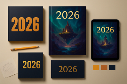
AI art used to look a little strange. You’d see hands with too many fingers or faces that didn’t line up. But things have changed fast. Today, AI has become one of the most useful tools in book cover design trends, especially for authors who want detailed, story-driven visuals without paying for full custom illustrations.
In 2026, designers and authors use tools like Midjourney, DALL·E, and Leonardo to build artwork that feels rich, cinematic, and full of atmosphere. When we say AI creates “otherworldly” art, we mean:
The best part? You can make all of this without hiring custom book cover design services. Honestly – how cool is that?
Honestly – how cool is that?
This is why fantasy and sci-fi authors use AI more than anyone else. It helps them show the exact world they wrote about instead of settling for a “close enough” stock photo.
But the real magic happens when designers combine AI with human editing:
The result is artwork that feels custom, detailed, and deeply connected to the story. If you're working on a fantasy, sci-fi, paranormal, or myth-inspired book, AI art can help you bring your world to life in a way traditional stock images never could.
If you're working on a fantasy, sci-fi, paranormal, or myth-inspired book, AI art can help you bring your world to life in a way traditional stock images never could.
In 2026, some covers don’t just look cool; they do something. This might sound futuristic, but it’s already happening. Books are becoming more than just pages and paper; they’re starting to respond, move, or even connect to your phone.
Let’s break it down.
In ebooks, you’ll see:
In physical books:
For example, “Heartstopper” special editions used spot gloss, embossing, and hidden interior art to give readers small surprises. This approach shows how even a simple interaction can deepen emotional connection with the book.
Readers today want to feel included, and interactive design helps with that. If you’re working on a book cover illustration service, think about adding something small that invites the reader to explore. Even a simple texture or hidden detail can make a big difference.
This year, clean and minimal is stepping aside. Readers want covers that feel handmade, artistic, and a little messy, in the best way possible.
2026 is all about layering. Yes, designers are mixing photography, paint strokes, doodles, torn paper, and textures all in one cover.
You’ll see this trend in:
Some examples?
These cool book covers feel more human. They give the reader something to study, almost like a journal page. If your book is emotional, artistic, or deeply personal, this style can help people feel closer to it before they read a single word.
A good example of this is “Crying in H Mart” and “The Anthropocene Reviewed,” both of which leaned into layered, personal-feeling design styles. Their covers tell a story before you turn the first page.
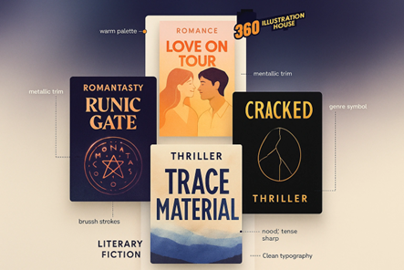
Every genre has its own “look,” and in 2026, designers are updating those looks in fun new ways.
Instead of sticking to the old rules, they’re mixing modern styles with familiar genre elements so the covers feel fresh but still recognizable to readers.
Here’s what that looks like:
The rise of “romantasy” shows this clearly. Designers mix soft romance silhouettes with neon fantasy symbols, giving readers the warm romance vibe and the magical fantasy hint in one cover. It tells you exactly what kind of story to expect.
Understanding how your genre uses current trends helps your novel's cover design look updated without confusing readers. It keeps your design modern while still fitting the expectations of your audience.
In 2026, one-size-fits-all is not applicable anymore. Writers who still like this, I have a message for you: “Please stop!”
Readers today are clever. They want books that feel like they were made for their taste, their niche, and their corner of the reading world. When a cover speaks directly to a specific audience, it creates instant trust. It tells the reader, “Yes, this book is for you,” and that connection often leads to a faster purchase.
Covers aimed at a specific niche audience often outperform broad, general ones. This includes:
The rise of “cottagecore fantasy” book covers shows how targeted visual language helps books hit the right readers at first glance. People want books that feel like they were created for them.
Nowadays, most readers don’t find books by walking through bookstores. They find them while scrolling. And that changes everything about how book covers need to look.
On TikTok or Instagram, your cover has just a few seconds to catch someone’s eye. If it doesn’t stand out as a tiny image on a phone screen, it might get skipped.
Here’s what’s working in 2026:
Take Colleen Hoover’s newer editions—they were redesigned with social media in mind. Bold fonts, clearer layouts, and colors that work on screen.
Or take the redesign of “The Seven Husbands of Evelyn Hugo,” which showed how digital-friendly colors and typography can revive a book years after release. After its redesign, sales surged again because the cover performed well online.
If you’re thinking about how to make a book cover that performs well online, look at what’s getting shared rather than just what looks good in print. Make a list of trending books and analyze their covers. See how their designs are showing up and what is unique about their covers.
In simpler words: If your book doesn’t look good at a tiny size, it might get skipped.
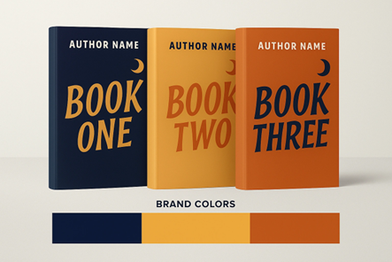
If you're planning to write more than one book, this part is for you. In 2026, readers don’t just look at one title. They check your whole lineup to see if your books feel connected. This is where strong author branding makes a real difference.
When your covers share a clear style, readers recognize them faster. It builds trust and helps your books stand out in a busy marketplace, whether you’re self-published or working with a traditional publisher.
Here’s how authors keep their covers consistent:
You can see a great example of this in Sarah J. Maas’ series redesigns. Even when the artwork changed from illustrated to more minimal styles, the branding stayed strong. Her covers still matched in tone, spacing, typography, and mood. Because of that, readers can spot her books instantly on shelves and online.
This approach works for nonfiction, too. Brené Brown’s books have a steady, warm, professional look, and Leigh Bardugo’s fantasy series also follows a consistent visual identity.
The key is simple: make your custom book cover design feel like part of a larger world. When someone loves one of your books, they should be able to recognize the next one right away.
Mixing three or four fonts might seem creative, but it usually looks messy. Stick to one main font for your title and one simpler font for your name or tagline.
This keeps the design clean and easy to read. If your genre allows, you can use font variations (bold or italic) instead of entirely new styles.
A beautiful color palette doesn’t matter if your title disappears into the background. Make sure there’s enough contrast between text and image.
Light text on dark backgrounds or dark text on light ones works best. Always test how your cover looks in small sizes because that’s how readers will see it online.
It’s smart to research trending books, but copying their covers too closely can hurt your brand. Readers might mistake your book for a knockoff, and platforms can even flag similar designs. Take inspiration, but make it your own with a unique twist or color scheme.
Every genre has a visual language. A thriller shouldn’t look like a romance, and a fantasy cover shouldn’t look like a business guide. Study what works in your niche before finalizing your design. Matching the right book cover illustration style with your genre helps readers instantly recognize what they’re getting.
Before you publish, always show your cover to others—especially people who read your genre. They’ll notice things you might have missed. A second opinion can save you from costly redesigns later.
Avoid these mistakes, and your cover will look professional, trustworthy, and ready to compete on any shelf or screen.
So, what does all of this mean for you? In 2026, your book cover does more than make a book look nice. It helps readers decide if your story is worth their time. A good cover works like a quiet salesperson. It stops someone from scrolling, makes them curious, and pushes them closer to reading the first page.
The book cover design trends that we discussed are here for a reason. When you implement or add these trends into your cover, it becomes something readers remember, not something they skip.
Whether you create your own design or hire a professional, keep one thing in mind: your cover should talk directly to the person who will enjoy your book the most. If it makes the right reader stop, look twice, and feel something, then it’s doing its job.
Lastly, try new ideas. Always test different looks. The possibilities are endless, and most importantly, be flexible. Look around to see what's working and what is not loved.
You’ve put time into writing your book. Your cover should carry that same care so readers feel it at first glance.
Looking for more information? Call us at +1 (855) 521-5040 for quick support!


Have a project in mind? Reach out to us, and we’ll help turn your ideas into stunning illustrations.
Tell us what you need, and we’ll create a custom illustration just for you. Reach out today and let's get started!

Copyright © 2026 360 Illustration House | All rights reserved. Terms And Conditions | Privacy Policy | Refund Policy
